@Freddie just solved the problem - the emergency stop button locks off. Twisting the big red knob releases it, & then the machine can be switched on. I’m going home now before I do any damage!
Had a productive evening making Bridge Rectifier signage & some temporary signage for our open day. Worked through various settings for corrugated cardboard & 3mm MDF on small samples, then cut from larger sheets. Still a bit of tweaking to do, and need to test settings for red acrylic sheet, as this will look good suspended across the main hallway of Hebble End Works. I want to try to etch the BR logo area, put hanging holes in & and make 1 sign the shape of an arrow.
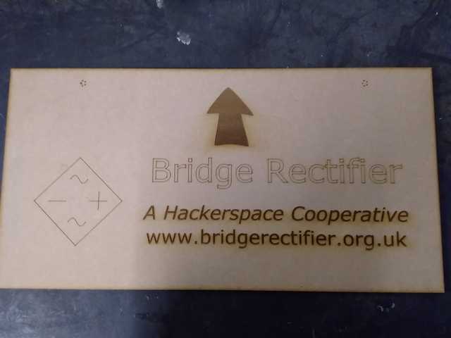
Aimed to cut out of sheets nearly 40cm wide. Here’s 1 sign in MDF and corrugated card.
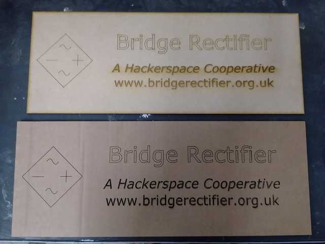
For MDF, settings were (speed/ power/ corner power): Vector score 40/ 20/ 18; Engrave (footer text) 200/ 25; Cut-through rectangular outline 16/ 90. The engraved footer text is a little scorched/ blurred.
For corrugated card, settings were: Vector score 20/ 20/ 15; Engrave 120/ 20; Cut-through 12/ 40/ 20. It came out very crisp.
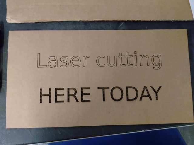
Here’s a temporary sign for the event:
A 2nd was nearly finished when an edge started glowing red due to the waste strip being too narrow & frayed - it’s a learning curve!
1 Like
We learnt a very useful trick from @Freddie last night, which could save a lot of time swapping between Inkscape & the laser-cutter software. It’s possible to create an image file any size in Inkscape, then after loading onto the laser-cutter PC, alter the size using an icon halfway down the left - looks like 2 boxes overlapping each other.
This means we can cut a small test piece, then enlarge to a defined size without having to edit the Inkscape file.
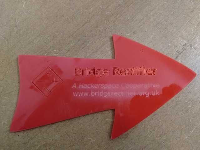
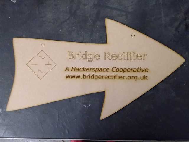
Had another go at signage tonight. Couldn’t get it striking enough on red acrylic sheet, so I made a couple out of MDF that I’ll wire up tomorrow in the middle of the main hallway of Hebble End Works. I’ll also stick some temporary signs on the front door etc.
You can melt wax into the cuts/engraves on acrylic to make them more readable. Basically, scribble all over the bits you want the wax to go with a wax stick or crayon, then use a hair dryer or heat gun to carefully melt it. Clean the top surface, and you can end up with really great looking results. I’ve done it before and it was pretty easy.
Here’s a more detailed run down of the process:
1 Like
Just speaking about this with @9600, and he pointed me to these which look even easier to use:
http://www.mastergrave.co.uk/catalogue/detail.php?product_ID=1621&product_Category_ID=67
Looking forward to trying those, particularly on signage, @davidhayward and @9600. Although it’s currently difficult to read the text on the red acrylic sample I produced, a red sign would really stand out in the main hallway at Hebble End. Just need to overcome the minor detail of making the text legible . . . .
I also wonder how long batteries would last with edge-lit acrylic sheet using LED(s). I’d like a sign to show when BR are in the building, which ideally could be reached to switch on/ off easily. That way, people would be less likely to lock us in. Having said that, someone locked the grill on me yesterday, & I was pleasantly surprised to find I could actually reach my arm out & around to unlock.
@RoboGuy if you want something that is highly legible the best way is to actually cut the letters out. This means the addition of small tabs to attach the inner parts on some letters, or making a sandwich as follows:
- Base layer of any colour
- Middle layer background of one colour, with letters cut out
- Middle layer inserts of another colour, cut to fill in the holes in (2)
- Top layer of clear acrylic
- Nuts and bolts at corners to clamp the layers together
In practice the design for (2) and (3) is exactly the same, albeit you might move the bits of the design for the latter inwards from the edges, so as to minimise wastage.
Wax filling is another option, but it’s still far from optimal for public signage…
Certainly worth thinking through alternative approaches for signage, & what our requirements are. Conscious that a bold colour like red would ‘pop’ more in that hallway than clear acrylic. Anyway, something for another day . . . .
Apparently, installing Inkscape on Apple Mac can be problematic, as reported by a prospective new member at the weekend, and confirmed by @davidhayward. As we need to ensure that everyone can use the laser-cutter without any hitches, I just found this response, which various people claim works ok:
"Sat Jul 25, 2015 4:25 am. I was able to get Inkscape to run by doing the following:
-
Go to the “System Preferences” and open “Security & Privacy”.
-
On the “General” tab, at the bottom, change the “Allow apps downloaded from:” to the “Anywhere” option.
-
Start Inkscape. After it has successfully started, go back to the “Security & Privacy” settings and change it back to the default “Mac App Store and identified developers”.
Any chance of testing this, @davidhayward? There are lots of other comments here: http://www.inkscapeforum.com/viewtopic.php?t=19119#p73035
A quicker way is to CTRL+click on the application file, select Open from the menu that pops up, then hit Open again in the dialog that pops up. Once this is done, the program will open normally from then on.
@RoboGuy if he has Adobe Illustrator he is probably far better off just using that. Lots of people do for laser cutting.
Making some progress with preparing to cut better signs for Bridge Rectifier. Researched stencil fonts, as the only way to make a sign from a single sheet without parts of the letters falling out. Found this review of fonts: 25 top free stencil fonts | Creative Bloq
Mixed case fonts include: mixed case fonts - ag, scriber, kaine, urban sketch, stardos. I chose StarDos and downloaded, then dragged files into Fonts directory, found by Control Panel > Fonts. So, text part of sign looks like this:

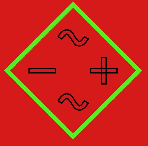
Then set about trying to achieve the same with BR’s logo. Eventually discovered that the 3 characters in the outline (~, +, -) are all strokes (size 1) with no fill. By selecting each individually (Ctl & Select arrow), I could create a stroke outline by first converting the character to a path, ie select 1 character, then Path > Stroke to Path (instead of Object to Path), then change fill to contrasting colour, add stroke, reduce thickness from 1 to 0.3, finally remove fill.
Managed to create ~ and - as outlines that the laser cutter can cut through. With the +, the vertical and horizontal rectangles intersect, which means at the 2nd pass, the cutter would be burning through nothing. Instead, it needs to cut all around the outside of +. Here’s where I’ve got to (the red background is just for contrast):
I’ve tried getting the difference between the vertical & horizontal, but it deletes the whole horizontal, not just the middle square. Any tricks you can think of, @Freddie?
1 Like
Think I’ve just found an obvious answer to that problem. I entered ‘+’ as text, converted Object to Path, then put a stroke around it, with no fill. Sorted. Just need to divide the diamond shape into 2 halves now . . .
Nice work! I know it’s not done that way for aesthetic reasons — at least I think… — but I really like that flouro/trippy BR logo. A red t-shirt with black and green like that would look great 
Looks great guy! For future reference, “difference” subtracts the second shape from the first. As you’re wanting to add the two shapes together (i.e. you want the border to be around all of them) you want “union” instead, from the same menu.
Ah yes, @Freddie. Obvious now you mention it. I assumed that would combine the overlapping lines, but I’ve just done that & it works. A lot quicker than all the faffing I went through will all sorts of options. So, I’ll stick with working from the original logo, and not add a ‘+’. Thanks
Struggling with Path > Cut Path now to split the logo outline into 2 pairs of diagonal lines - so the entire shape doesn’t srop out. Selected diamond outline & vertical rectangle, and Path > Cut Path, but nothing happens
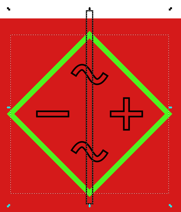
I’ve tried it with 0, 1 or both starting off after already being converted to paths by Object to Path. Thanks for any suggestions, @freddie. I don’t mind if I have to copy the central 4 characters out & paste back after, but that isn’t the problem. Very time consuming all this, but hopefully my trials will save time for others . . . .
Some of these things are coming together now - just been to do a quick test of a draft sign. The stencil font mostly works at this scale - just 175mm total width, and cutting through the logo characters works, along with the holes for wiring up the larger final version - probably in red acrylic sheet.
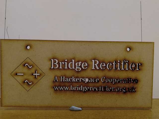
I still need to divide the diamond outline into 2 halves, so it doesn’t fall out when cut through. The sign outline is supposed to have rounded corners, but I’m not seeing those. For completeness, I may try another stencil font & then pick the best.
Also tested this figure drawing. It was scanned as a JPG ages ago from a quick pen sketch.
I started from this tutorial: https://inkscape.org/en/doc/tracing/tutorial-tracing.html.
Open template file in Inkscape, File > Save As [new name].
Open JPG source image - dark line drawing on white background
& ‘A’ to select all, then ‘C’ to copy, and in blank template, ‘V’ to paste
With image still selected in new file, Path > Trace Bitmap
Brightness Steps with Scans = 2
Tick boxes for Smooth & Stack Scans, Remove Background (though maybe don’t always check the last one?)
New image is overlaid exactly over the original
Drag one away from the other, & delete the original.
Don’t forget to draw a rectangular outline for the cut-through! I fancy cutting a more wavy rectangle as another test sometime.
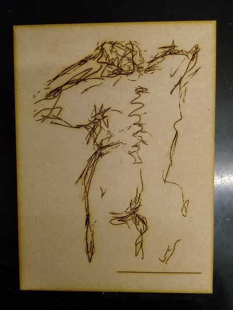
I was a bit alarmed when I saw the size of the DXF file at 8Mb, but I just selected the image in SVG again, & Path > Simplify Path, which I’d read reduces the number of nodes without noticeably affecting the drawing - in this example anyway. I haven’t checked whether there are adjustable settings for that, but it came down to 1.5Mb. The image took under 4 minutes to cut at 20cm tall.
I need to delete the horizontal line near the bottom - produced from scanning. I know I can fix that quickly in Photoshop, but I should really figure out how to do it in Inkscape . . . . .